
This project aims to prove that even in our attempts as designers to create cool simplicity, being accessible 1st can go a long way; Both in design, functionality, and gravitating users. That accessibility 1st can go hand in hand with captivating designs. Because quite frankly, brutalism as a concept is inherently inclusive of access. Both in information and functionality. And for those who need a hand grasping accessibility should take on brutalism as a challenge.
Brutalism. The use of centers, minimal, lines, and flats- has dominated UI/UX web design spaces since 2021. And quite frankly, it is still trending strong in 2022.
“Brutalism in digital design is a style that intentionally attempts to look raw, haphazard, or [plain]. It echoes early 1990s-style websites,” (Kate Moran, 2017). Many of what we see in recent Brutalist UI designs appear as naked HTML site with blue links, harsh lines, plain colors, 2D - very flat and monochromatic Monospace font.
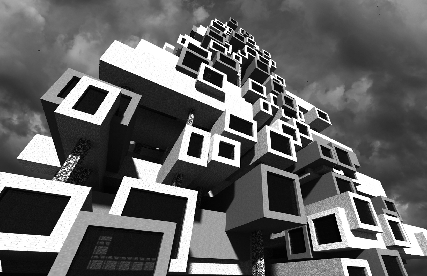
In architecture, “Brutialism is rooted in the ideas of functionalism and monumental simplicity that had defined earlier architectural modernism… Brutalism is a utilitarian aesthetic movement that shuns decoration in favor of exposing and celebrating the raw materials used to construct the design,” (Le Corbusier & Marcel Breuer).
These architectural concepts have definitely transpired through modern UI design. Though now, it continues to embrace flat design, strong outlines, contrasting colors, bold typography and real/life photography.
Alongside that, it embraces grids that guides user eye movements. And while these bold simplicity aims to captivate user attention, oftentimes- designers and clients alike neglect the essence and imperative nature of accessibility when it comes to brutalism.
The challenge is accessiblity. How can beginer coders, web designers, and clients approach app designs being accessblity 1st and aesthically pleasing simontanouly.
Colors: this too can be aesthetically pleasing and accessible friendly. There is beauty in contrasting colors.
Grids: they guide the glide of the user's eyes through the page. chose their direction and placement well.
Lines: Bold or thin, separating content enhances readability.
Fonts:Bigger can be better, but not always. When it comes to having more white space available, bigger fonts throughout a page’s layout isn’t always best. Stick with the golden rule- bigger for titles, and headers. Bolds & Italics for emphasis. Plane size for details and paragraphs. But just the same, you can go with monosized fonts throughout entire page - if that’s your aesthetic
Icons & images: Some web design takes brutalism rarely consisting of icons or many images. Studies have shown that when it comes to accessibility, icons & images are worldly understood by users and are more inclusive than words can only be. Add them.

To complete this project we began researching and analyzing sample sites for background and context. To understand Brutalsim and its relevance in the push for web accessibility. In phase 2 we focused on color theory and aesthetic features of contrasting colors. Phase 3 we began building our exemplary project wireframe using Figma, Coolors, open source images, notion, maze and w3c contrast checker. Then finally deploying the project.
We found that in the case of Brutalism, you can do no wrong with accessibility. From composing a web app with monochromatic analogous color to high contrasting pop colors; monosized fonts to the push for more icons and images- everyone's aesthetic needs can be met.